Income growth and the share of the total
Who gets America’s income?
PennyCalc · Last updated: · Data: 1979-2023, CBO September 2026 release
CBO released its 2023 income-distribution update on September 24, 2026, so we rebuilt this comparison using the full revised 1979-2023 series. Our buying-power comparison left two questions: how much did incomes grow, and how did each group’s share of total income change?
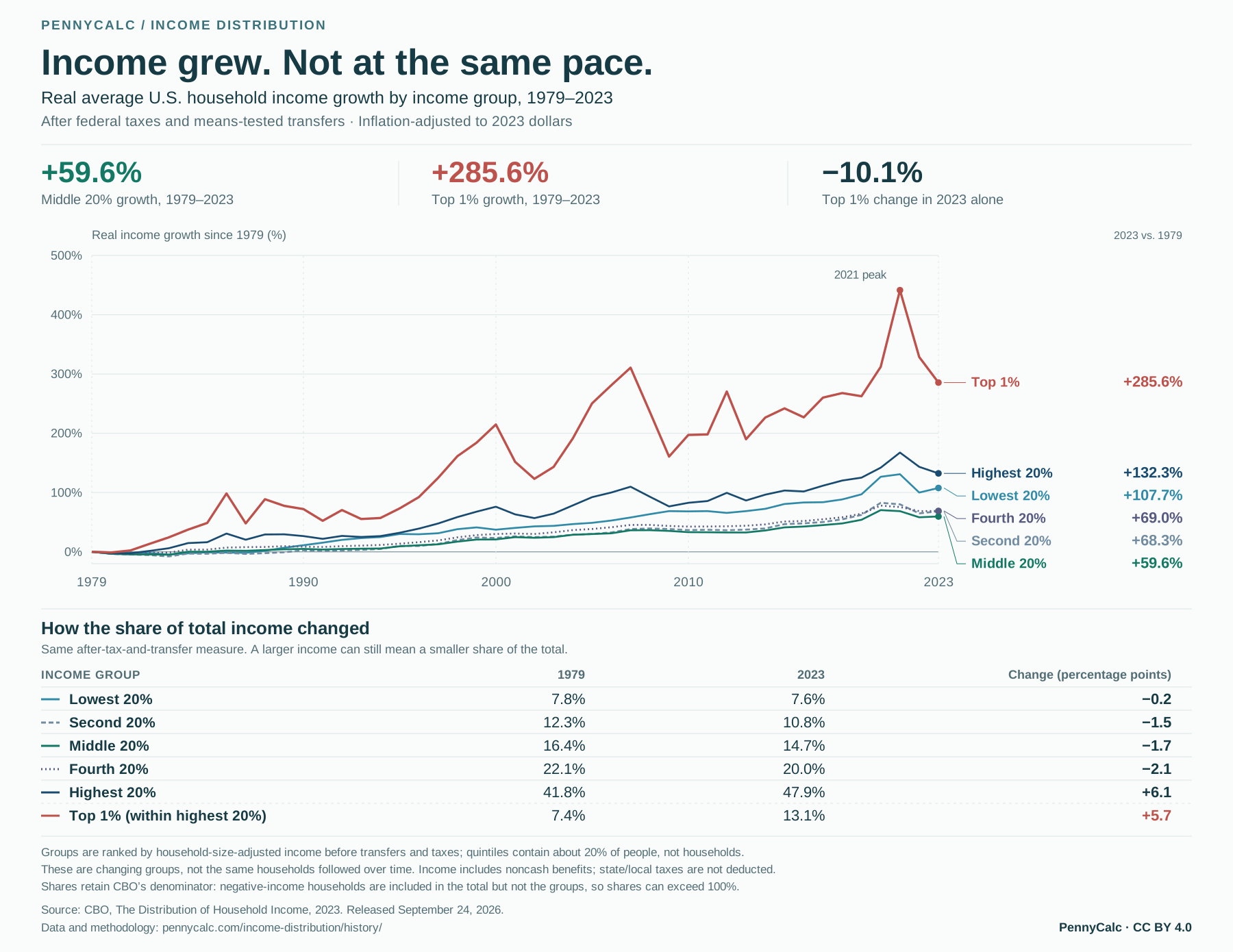
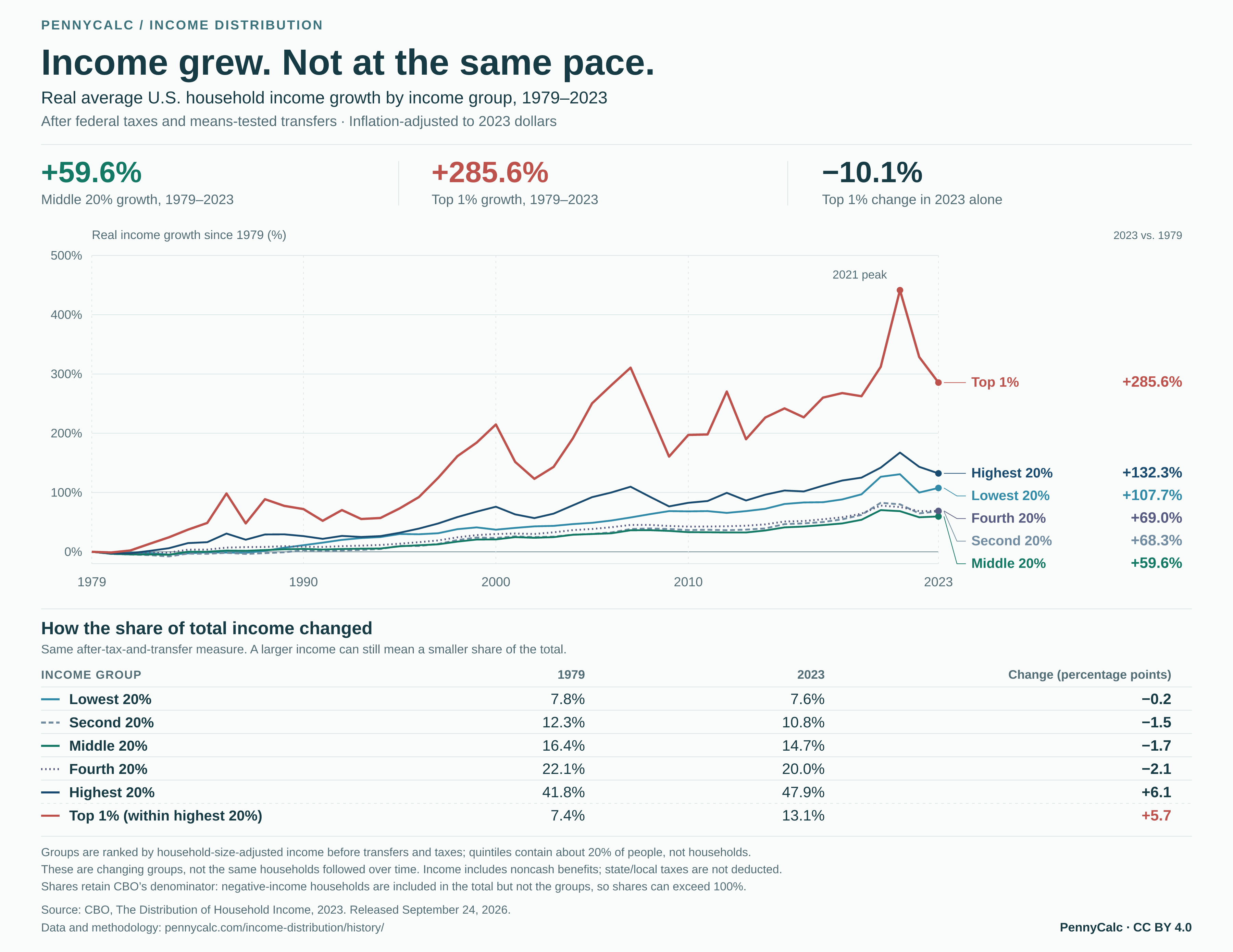
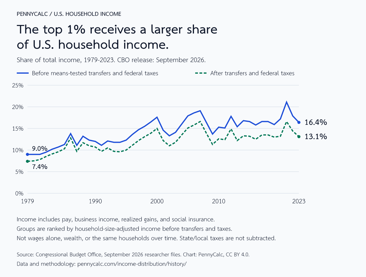
The middle fifth’s average income after federal taxes and means-tested transfers rose 59.6% after inflation, while its share of that income fell from 16.4% to 14.7%. The top 1% gained 285.6%, and its share rose from 7.4% to 13.1%. A larger amount and a smaller share can happen at the same time.
Income grew. Not at the same pace.
Each line shows the percentage change from that group’s own 1979 average, after federal taxes and means-tested transfers. Every annual point is plotted from CBO’s data, including the early declines and the sharp movements around the pandemic.
Explore the annual growth lines
Move across the chart to inspect a year. The vertical guide snaps to each annual CBO observation and shows every group’s real growth from 1979, plus its average after-tax-and-transfer income. Tap the chart or use the year slider on touch devices.
Selected year
Growth vs. 1979 · average income in 2023 dollars
The newest year is not another step upward for everyone. The top 1%’s real average income after transfers and taxes fell 10.1% from 2022 to 2023. CBO reports that income inequality declined in the latest year, largely because realized capital gains fell. That annual decline sits alongside the longer-term increase in income concentration. See CBO’s findings.
Source: Congressional Budget Office, September 2026 release. All 45 years use the same revised vintage. Top 1% is included in highest 20%; these are changing income groups, not the same households over time.
A smaller slice can still be a bigger amount
The middle fifth’s average income after federal taxes and means-tested transfers rose from $57,000 to $91,000 in 2023 dollars. Its share of total income nevertheless fell. These are different comparisons: growth measures the change from the group’s own starting income, while share measures its portion of the total.
| Income group | Real growth, 1979-2023 | Share in 1979 | Share in 2023 | Share change (percentage points) |
|---|---|---|---|---|
| Lowest 20% | +107.7% | 7.8% | 7.6% | −0.2 |
| Second 20% | +68.3% | 12.3% | 10.8% | −1.5 |
| Middle 20% | +59.6% | 16.4% | 14.7% | −1.7 |
| Fourth 20% | +69.0% | 22.1% | 20.0% | −2.1 |
| Highest 20% | +132.3% | 41.8% | 47.9% | +6.1 |
| Top 1% (within highest 20%) | +285.6% | 7.4% | 13.1% | +5.7 |
The top 1% overlaps the highest fifth. CBO excludes negative-income households from the displayed groups but retains them in the total, so shares can sum to more than 100%. We retain the published shares rather than normalize them.
Compare real growth before and after transfers and taxes
| Group | Before: real growth | After: real growth |
|---|---|---|
| Lowest 20% | +50.0% | +107.7% |
| Second 20% | +38.7% | +68.3% |
| Middle 20% | +41.5% | +59.6% |
| Fourth 20% | +56.9% | +69.0% |
| Highest 20% | +127.8% | +132.3% |
| Top 1% | +269.9% | +285.6% |
The data support a narrower conclusion than “all the gains went to the rich.” Average real income increased across the groups over the full period, but at different rates. This comparison does not establish that an extra dollar at the top was taken from someone else, or identify which policy caused a particular change.
What does the top 1% actually earn?
Compare the starting year with the pandemic-era surge and the following declines. Capital income includes interest, dividends, rent and realized gains. Business income is shown separately. All figures are average dollars per household in the top 1%, adjusted to 2023 prices.
| Source of income | 1979 | 2019 | 2021 | 2022 | 2023 |
|---|---|---|---|---|---|
| Labor compensation | $222,600 | $776,100 | $915,600 | $804,700 | $779,400 |
| Business income | $72,600 | $499,500 | $693,800 | $682,900 | $598,200 |
| Capital income, including realized gains | $375,600 | $943,900 | $1,752,600 | $1,224,600 | $1,066,400 |
| Of capital income: realized gains (subset) | $165,700 | $577,700 | $1,332,500 | $778,800 | $546,900 |
| Social insurance | $6,900 | $16,700 | $18,500 | $18,100 | $19,200 |
| Other income | $12,600 | $83,500 | $98,100 | $89,100 | $90,100 |
Realized gains are part of capital income, not an additional component. Components and totals are separately rounded in the source, so they may differ slightly when added. Labor compensation includes employer benefits and payroll taxes. Unsold asset appreciation is not counted as realized income.
Why did more income end up at the top?
There is no single switch that explains four decades. Some changes affect what people earn. Others affect when income shows up or what it is called. The useful question is which mechanism a particular claim is describing.
1. Selling an asset can turn years of gains into one year's income
A salary generally arrives each year. An investment gain may appear in the income data only when someone sells. That makes high incomes more sensitive to markets and the timing of sales. CBO links the declines at the top in 2022 and 2023 to realized gains falling from their unusually high 2021 level. A lower share in one year does not establish that the long-term trend reversed. CBO’s current report traces that change.
Is this just a capital-gains story? CBO tested a version excluding realized gains. Measured inequality was lower, but the broader long-run rise remained. Simply subtracting gains from this chart would not reproduce that study, because changing the definition also changes who ranks at the top.
2. Business income is not always passive investment income
The top includes people running professional practices and regional businesses, not just public-company CEOs. Research linking businesses to their owners found that profits often fell sharply after owners retired or died. That suggests the owner's work, expertise, and relationships help generate income classified as business profit. The study also found both productivity growth and a rising owner share of business value added. “Labor versus capital” is a useful distinction, but the categories do not cleanly separate effort from ownership.
3. The 1986 tax reform changed how some income was reported
After the reform, individual and corporate tax rates created a stronger reason for some businesses to operate as S corporations. Their profits flow through to owners' individual returns. Income previously appearing as wages, dividends, or capital gains could appear as business income instead. The IRS studied the wave of conversions, and CBO explains the classification issue.
This is a reason to be careful when interpreting category changes, not a reason to dismiss the whole trend. Our federal tax-rate history supplies the policy timeline. A rate changing beside a line on a chart does not tell us how much that rate caused the line to move.
4. Some compensation rises with the stock market
Stock and option awards connect compensation to company value. Depending on the award and its tax treatment, returns related to work can show up in different income categories. Federal Reserve research on executive pay from 1936 to 2005 documents a sharp increase after a relatively flat mid-century period, while testing several competing explanations. Executives are part of the story, but they are not the entire top 1%.
Ownership also determines who benefits when assets rise. Our stock-ownership history shows how concentrated those assets are. It ranks households by wealth, so its top 1% is a different group from the top 1% by income here.
5. Technology, trade, and bargaining power affect earnings too
Research on job polarization describes growing rewards for abstract tasks alongside pressure on routine work. Research on Chinese import competition finds persistent employment and wage effects in more exposed U.S. regions. These mechanisms help explain differences between workers; neither study assigns a fixed portion of the national top 1% trend to its mechanism.
How workers negotiate matters as well. Historical research on unions and inequality finds a persistent income advantage for union households and a role for unions in narrowing income differences. Bargaining, skills, institutions, and technology interact. This page cannot divide their contributions into percentages that add to 100.
6. Taxes and benefits change the result, especially in unusual years
The pandemic is a useful stress test. Temporary relief and refundable credits raised resources near the bottom in 2020 and 2021. Their expiration helped pull after-tax income down in 2022, while falling investment gains pulled it down at the top. Similar-looking declines had different causes. CBO's breakdown separates those channels.
The before/after comparison is an accounting view of the tax and benefit system. It is not an estimate of what wages, investment, or business decisions would have been in a world without those policies.
7. More resources do not always mean more cash for the monthly budget
CBO includes employer health insurance, Medicare, and means-tested health coverage in its income measures. Those benefits have value, but you cannot spend them on rent. CBO's health-insurance sensitivity study finds slower measured income growth when health insurance is excluded, especially near the bottom. That is one reason a broad resource measure can improve more than someone's cash budget seems to improve.
For a separate look at cash earnings and household money income, use our five-measure buying-power comparison. It uses Census data and a different inflation method. The pages answer related questions, but their growth rates are not interchangeable.
What we would check before drawing a conclusion
- Which people? CBO ranks households by income before transfers and taxes divided by the square root of household size. Quintiles contain approximately equal numbers of people, not households. The after-tax series uses those same groups. Households can move between groups from year to year.
- Which income? Before means-tested transfers and federal taxes includes market income and social insurance. After adds means-tested cash and in-kind transfers, then subtracts federal individual income, payroll, corporate and excise taxes. State and local taxes are not subtracted. This is broader than a paycheck or cash disposable income.
- Which prices? Average dollar amounts use CBO’s 2023-dollar PCE adjustment. Percentage growth equals ending real average divided by starting real average, minus one, multiplied by 100. Shares are percentages of total income under the corresponding definition. A share change is measured in percentage points.
- Which vintage? All 45 years come from the CBO September 2026 release. We replaced the full series rather than append a new endpoint to an older edition. The official researcher files supply the figures; our JSON records the archive fingerprint and exact source files and fields.
- Which precision? CBO rounds dollar amounts to $100 and income shares to 0.1 percentage point. Growth is calculated from those published real means and displayed to one decimal place. The annual chart joins actual observations with straight segments; it does not smooth or invent intermediate years.
- What is missing? Negative-income households are excluded from displayed groups but remain in all-households totals. Shares therefore need not sum to exactly 100%. Unrealized asset gains are not realized income, and an annual income flow is not accumulated wealth.
Why start in 1979? It is CBO’s first year with the relevant tax-return data, not a stand-in for the entire 1970s. Why stop in 2023? It is the latest observation in the release, not the year it was published. See CBO’s current report and methodology and definitions. This is a descriptive comparison, not a causal model.
The national average can also miss what matters to an individual budget: local housing costs, household size, medical needs and changes in hours worked. The companion pages investigate those questions with different data; their income definitions and growth rates are not interchangeable.
Annual shares and real income for the selected group
Top 1%. Change the income group above to update this table. Dollar values are averages in 2023 dollars.
| Year | Share before | Share after | Average before | Average after |
|---|---|---|---|---|
| 2023 | 16.4% | 13.1% | $2,553,400 | $1,729,200 |
| 2022 | 17.9% | 14.4% | $2,819,400 | $1,922,500 |
| 2021 | 21.1% | 16.6% | $3,478,600 | $2,428,300 |
| 2020 | 17.2% | 13.2% | $2,644,700 | $1,848,300 |
| 2019 | 15.9% | 13.0% | $2,319,600 | $1,625,800 |
| 2018 | 16.6% | 13.5% | $2,363,100 | $1,649,700 |
| 2017 | 16.6% | 13.5% | $2,355,300 | $1,615,400 |
| 2016 | 15.8% | 12.5% | $2,187,200 | $1,466,100 |
| 2015 | 16.6% | 13.2% | $2,298,100 | $1,533,800 |
| 2014 | 16.8% | 13.3% | $2,203,600 | $1,464,500 |
| 2013 | 15.4% | 12.2% | $1,957,700 | $1,300,500 |
| 2012 | 17.8% | 14.9% | $2,323,100 | $1,661,300 |
| 2011 | 15.1% | 12.4% | $1,881,300 | $1,336,600 |
| 2010 | 15.3% | 12.6% | $1,881,800 | $1,332,900 |
| 2009 | 13.7% | 11.3% | $1,639,000 | $1,169,000 |
| 2008 | 16.4% | 13.9% | $2,094,000 | $1,507,800 |
| 2007 | 19.1% | 16.6% | $2,564,700 | $1,841,900 |
| 2006 | 18.6% | 15.8% | $2,433,800 | $1,709,200 |
| 2005 | 17.9% | 15.1% | $2,250,500 | $1,572,100 |
| 2004 | 16.0% | 13.5% | $1,865,200 | $1,307,100 |
| 2003 | 14.1% | 11.8% | $1,564,200 | $1,091,000 |
| 2002 | 13.3% | 11.0% | $1,468,100 | $1,000,800 |
| 2001 | 14.6% | 12.2% | $1,659,900 | $1,129,300 |
| 2000 | 17.6% | 15.0% | $2,083,100 | $1,412,100 |
| 1999 | 16.5% | 13.9% | $1,890,200 | $1,274,500 |
| 1998 | 15.5% | 13.1% | $1,732,700 | $1,172,100 |
| 1997 | 14.7% | 12.2% | $1,521,800 | $1,008,200 |
| 1996 | 13.6% | 11.1% | $1,322,200 | $862,700 |
| 1995 | 12.3% | 10.0% | $1,191,600 | $777,100 |
| 1994 | 11.8% | 9.6% | $1,073,500 | $704,400 |
| 1993 | 11.8% | 9.7% | $1,041,900 | $696,800 |
| 1992 | 12.1% | 10.5% | $1,085,100 | $764,400 |
| 1991 | 11.1% | 9.7% | $960,000 | $683,200 |
| 1990 | 12.0% | 10.7% | $1,067,100 | $771,800 |
| 1989 | 12.3% | 11.0% | $1,103,400 | $796,200 |
| 1988 | 13.2% | 11.7% | $1,185,000 | $846,400 |
| 1987 | 11.1% | 9.7% | $947,700 | $663,600 |
| 1986 | 13.8% | 12.8% | $1,179,900 | $889,900 |
| 1985 | 11.3% | 10.3% | $901,300 | $666,900 |
| 1984 | 10.7% | 9.6% | $843,900 | $616,300 |
| 1983 | 10.2% | 9.1% | $761,500 | $557,800 |
| 1982 | 9.5% | 8.5% | $694,600 | $508,800 |
| 1981 | 9.0% | 7.8% | $659,200 | $458,500 |
| 1980 | 9.0% | 7.5% | $662,100 | $443,400 |
| 1979 | 9.0% | 7.4% | $690,300 | $448,500 |